 |
 |
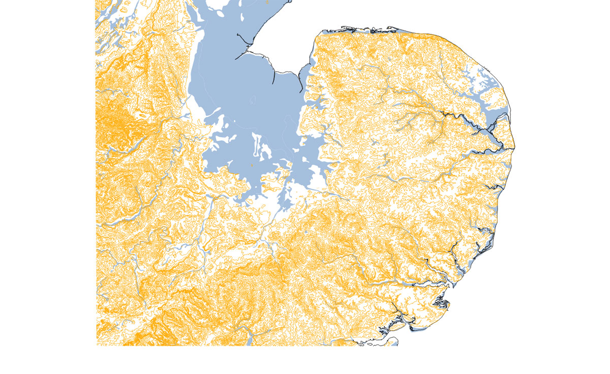
This example shows the basic East Anglian coast outline, (layer from OS Strategi) together with the British Geological Survey's surface deposits of peat and alluvium. There is no layer of rivers shown, but the alluvium helps to mark out where rivers may be found.
You will also need to load the clipped DTM file, even though you may not wish it to be visible. This is easily achieved by clicking to turn off the 'x' check mark in the Layers pane of QGIS.
If we want contours, these can be extracted using QGIS, by the process of 'Raster/Extraction/Contours', which will give a menu which allows the user to select the file to be processed, (which is your clipped DTM), the attribute name in question, (usually ELEV) and the desired intervals between contours.
The contour lines here represent a change in height of 50 metres, and even if the lines were labelled, the overall impression does not, in my opinion, result in a useful visualisation of the terrain. If we were dealing with a smaller area at a greater scale, then contour lines might well be your preferred option.
 |
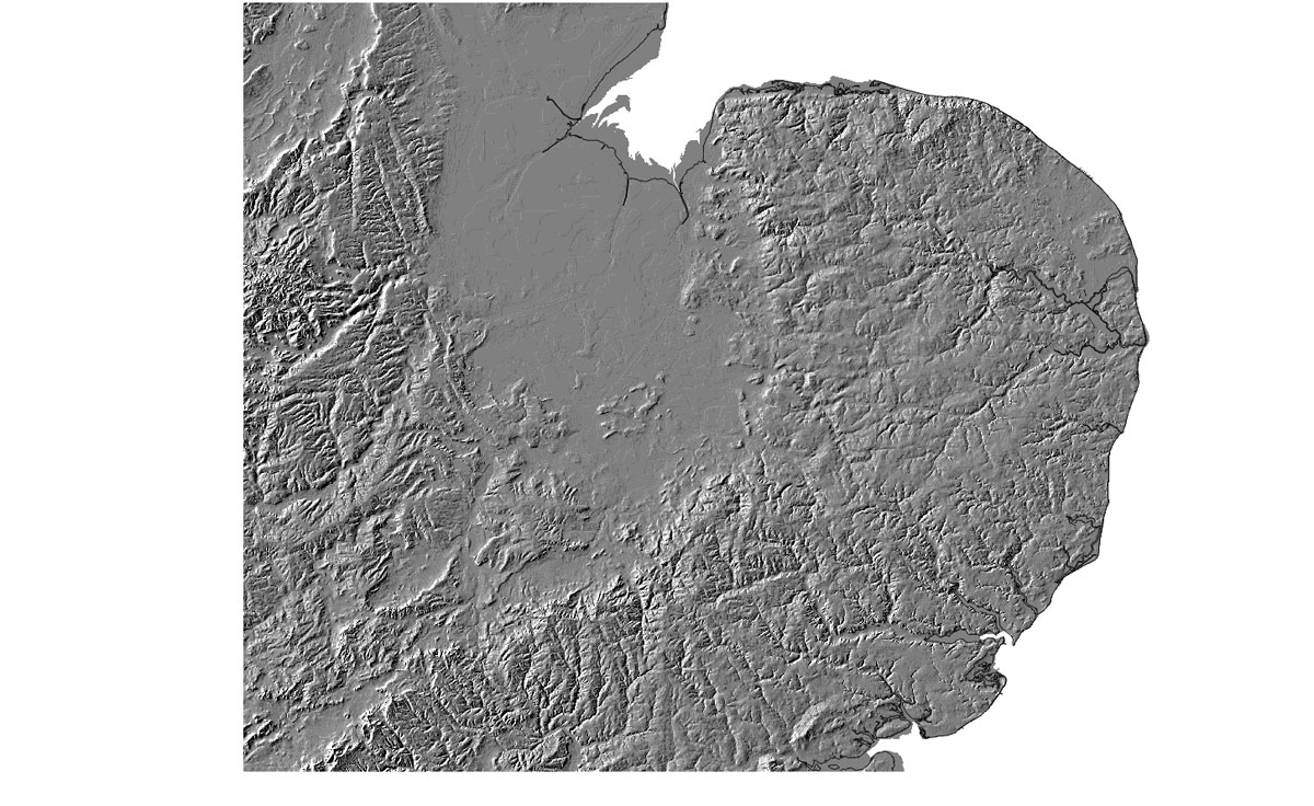
So let's have a look at a hillshade of the same area.
QGIS achieves this by the menus - Raster/Terrain Analysis/Hillshade. Also to be found under Raster/Terrain Analysis are the options of slope, aspect, relief, and ruggedness index. We will ignore these options at present. (But by all means try them out yourself.)
A Hillshade gives some idea of the terrain, but in East Anglia the height differences are small and so the hillshade only gives a rough overall impression. It becomes more impressive when used in conjunction with other layers. The obvious overlapping of the coastline within the Wash reflects areas of foreshore and sand which are often exposed above the tideline. These features also appear in OS Strategi map.
 |
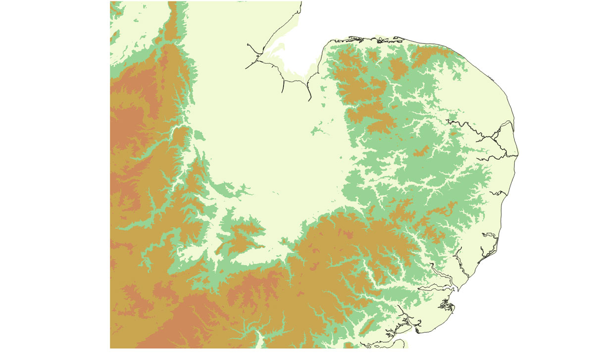
If we think about our old school atlases, we may recall that blocks of colour were used to show the terrain, usually with the lowlands shown in green, with higher ground in various shades of brown. By using QGIS styles applied to a DTM, we can, after some experimentation, arrive at a similar result. However, you will find that it is the choices you yourself make, as mapmaker, that determines the 'readability' of each map. By changing the height bands which you select to use, you may either clearly display a difference, or obscure it completely.
Here I have chosen to show heights up to 30 metres OD, 30 to 60m, 60 to 115m, and over 115m. There are only a few patches over 115 metres in height in Suffolk, but it is worth showing where these are.
Normally, by using one of the processes described above, a completely new layer is created. When we turn to styling, it is the original layer which has its appearance changed. So make sure that you have a clean copy of the DTM layer to style.
Double click on the layer name in the Layers panel to open the Layer Properties dialogue, and select the 'Style' tab. At the top by the label 'Render type' click the drop down list and select 'Singleband pseudocolor'.
In the 'Mode' drop down list select 'Equal interval' and select 'Classes' as '4'. Now click 'Classify', and 'Apply'. The result will show a random selection of colours and calculated height divisions you may not like.
To change these, first click on the line to change in the style window showing the selections. Double click on the height band to change and insert the height you require. Then complete the remaining heights. Similarly now repeat the selection of each line, but this time double click on the colour shown. You will be able to change the colour for each band as you wish.
When happy, click OK to dismiss the Layer Properties dialogue. I have selected the colours shown below, and the height bands already mentioned.
 |
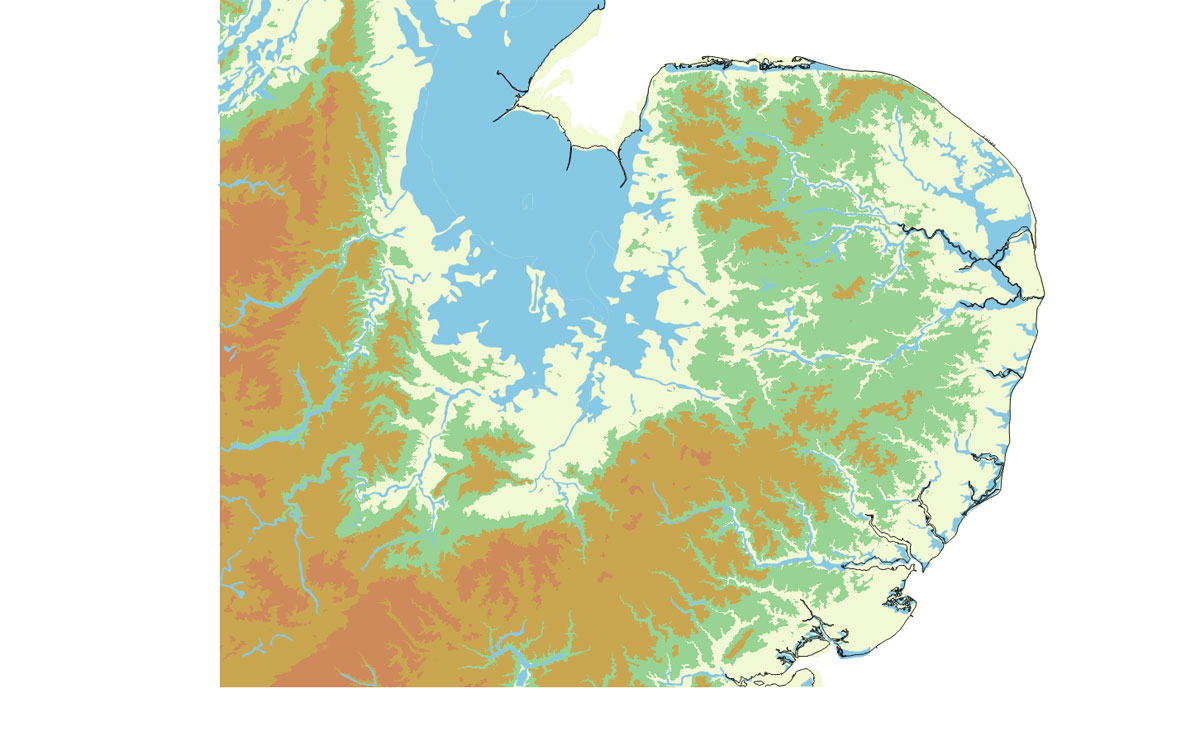
If we now add the clipped BGS surface deposits layer showing peat and alluvium, the fens take on a more familiar appearance. The 'islands' where habitation is possible stand out more clearly, and the Fenland edge is now obvious.
 |
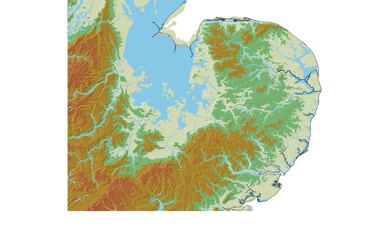
Finally, if the hillshade is added to the mix, the overall impression is much enhanced. It is a matter of taste just how many of such layers should be piled one on top of the other before the map becomes too cluttered.
The layers are read from bottom to top, so that the layer at the top overwrites the lower layers. In some cases, such as a town, this is what you want. In other cases you want information from lower layers to be visible as well as information from upper layers. In these cases the upper layers must be made transparent. The hillshade layer is usually placed at the lowest level. In order for the hillshade to be visible, the coloured DTM layer above it has to be made partially transparent.
This is easily achieved by opening the DTM layer Properties by double clicking on its layer name as before. Open the 'Transparency' tab, and move the 'Global transparency' slider to about 25%. (Try varying this amount if you like.) Click 'Apply' to see if you like the result, and when happy, click on 'OK' to dismiss the 'Layer Properties dialogue.
Changing a layer's transparency will also have the result of muting its colours, but this is then blended with the colour of the lower level. In this case it is the grey of the hillshade darkening the height bands.
 |
| Go to DIY digital mapping Homepage |
This page created 26th August 2015 Last updated 11th October 2015. | Go to Main Home Page |