 |
 |
This example of a map produced within QGIS demonstrates some of the possibilities of using data from a variety of sources and combining them to produce a desired effect. Here are combined a layer from the British Geological Survey with layers from the Ordnance Survey OpenData initiative. An outline of how this map was produced is contained in the article in the previous section.
Previously, all the maps illustrated have been produced straight out of QGIS without a key, or without any headings. The map must be open within QGIS. This straightforward printout is derived by clicking on 'Project/Save as Image' and navigating to where you wish to hold the resulting .PNG file.
( If you are not familiar with PNG, it stands for 'Portable Network Graphic', and is the open source near equivalent of a JPG file. It has the advantage of including transparency, which a JPG cannot do, and will be recognised by all computers without difficulty.)
When it comes to making a map for serious reproduction in print, QGIS has a special routine called Print Composer. Find it by clicking, 'Project/New Print Composer' and then giving the composer a name in the new dialogue that appears. A new window opens within which you will construct your map. The window is blank until you click 'Layout/Add map', but nothing happens until you draw a box in the blank window to designate the area to hold your map. I usually just include the whole of the available area, from top left corner to bottom right. As soon as you release your click, the box is drawn, and it will now contain a copy of the map from your open QGIS main window.
Use 'Layout/Add label' to draw a small box within the map area for the heading. Open the tab on the bottom right pane entitled 'Item Properties'. Under 'Main Properties' is a box containing the text message'QGIS'. Here you should type in your desired heading, overwriting the word 'QGIS' as you do so. Under 'Appearance' click on 'Font...', and change 'Font style' to 'Bold', and 'Size' to 16. This should fill your header box with this heading. You can 'Center' the text by clicking where you see the 'Horizontal Alignment' radio buttons.
 |
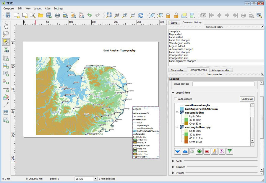
The picture above shows the Print Composer with the overpopulated Legend entries ready for editing.
You can now work through each legend entry and delete the unnecessary items by highlighting them and clicking on the 'Minus' sign button. You can move entries up and down to suit, and click on the pencil icon to amend the wording of an entry. Eventually you can make the legend change to suit yourself.
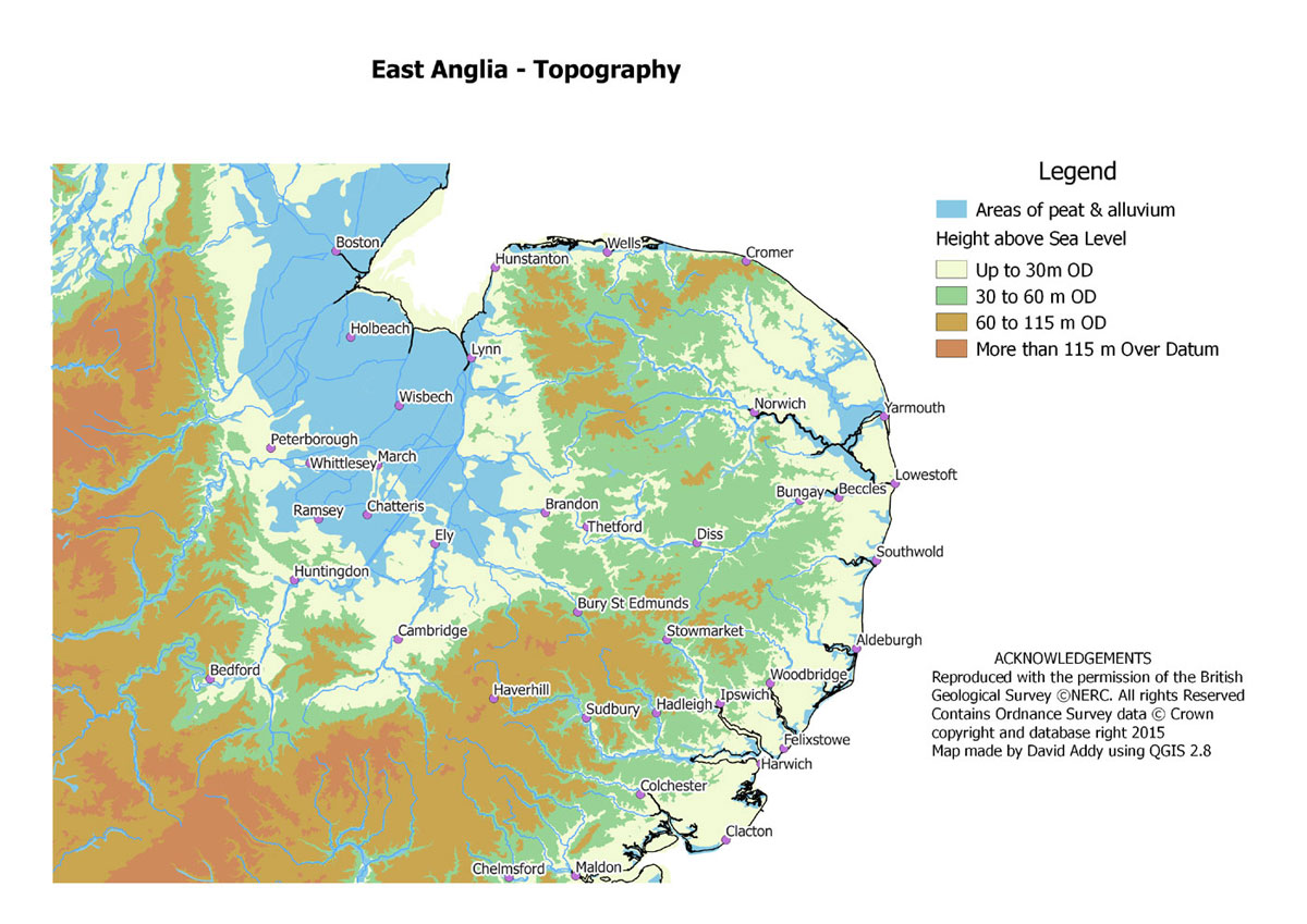
Go back to 'Layout/Add Label', and repeat the process to make another box to hold any acknowledgements you wish to record. The finished result might look like the next picture below.
 |
This example of the same map has added a further band of height in order to illustrate where the highest parts of the region are located. There is very little ground above 115 metres in Suffolk.
 |
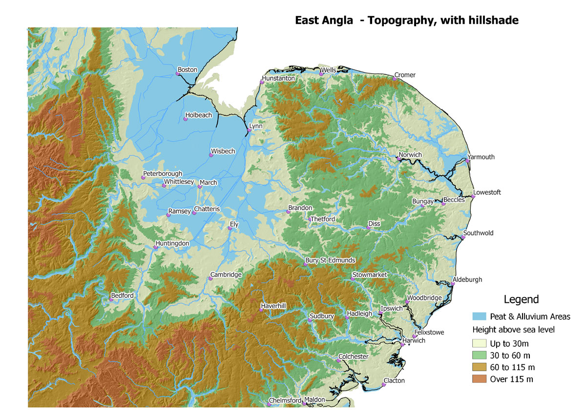
In some cases it is possible to add a little more 'punch' to a topographic map by underlying the coloured areas by a specific type of layer known as a "hillshade". Such an effect should be used carefully as it can overwhelm other details which the map is designed to illustrate.
 |
| Go to DIY digital mapping Homepage |
Page created 18th August 2015 Last updated 11th October 2015. | Go to Main Home Page |